Have you ever stumbled upon a website that just doesn't work right on your phone? Tiny text, images spilling out of the screen, navigation menus that are a puzzle in themselves – it's frustrating, to say the least. This is precisely why responsive web design isn't just a nice-to-have; it's a must-have. And at Embark Studio, responsive design isn't just an offering; it's our standard practice. Join us as we delve into why responsive design is critical in today's multi-device world.
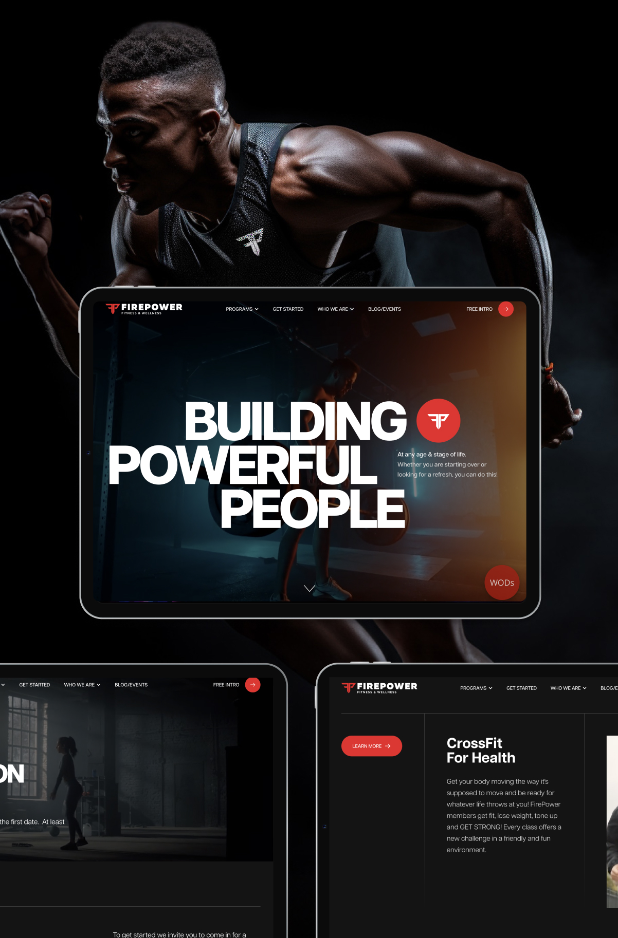
Responsive web design is the cornerstone of modern web development. It's a design approach that ensures a website adapts gracefully to various screen sizes and devices. This magic is achieved through fluid grids, flexible images, and media queries. The goal is simple: a seamless and consistent user experience, whether you're viewing a site on a desktop, a tablet, or a smartphone.
Web design has come a long way. From the fixed-width layouts of yesteryears to today's dynamic digital era, where mobile browsing is king, the shift has been monumental. Responsive design emerged from the need to make websites universally accessible and user-friendly, a principle that is a cornerstone at Embark Studio.
In our mobile-first world, responsive design is not just important; it's essential. It elevates user experience, bolsters SEO rankings, and offers cost-effective solutions for businesses. It's also about inclusivity - making sure that your website is accessible to as wide an audience as possible.
At Embark Studio, responsive design is the heartbeat of our work. Our approach is deeply rooted in a mobile-first strategy, ensuring that websites are not only visually appealing but also highly functional across all devices. We leverage tools like Webflow, which enable us to create bespoke websites that are inherently responsive. Webflow’s capabilities allow us to fine-tune every aspect of a website, ensuring optimal performance on any device.
Responsive design isn't without its challenges. Managing navigation and content prioritization across different devices requires a nuanced approach. At Embark Studio, we tackle these challenges creatively, ensuring that the websites we craft are as intuitive as they are visually striking.
In the digital realm, responsive web design is not just a technicality; it's a commitment to providing an exceptional user experience. At Embark Studio, we don't just build websites; we create digital experiences that are responsive, engaging, and tailored to your unique brand. Let us help you make a statement in the digital world with a website that’s not only responsive but also a true reflection of your vision.