Imagine entering a room where the walls are a vibrant red. How do you feel? Energized, alert, maybe a bit overwhelmed? Now, picture a room bathed in soft blue hues. Feel calmer? That’s the power of color - a silent yet persuasive force, especially in the world of web design. In this article, we'll dive into the fascinating world of color psychology and how it can transform your website from just a digital space to an emotional experience.
Color psychology is the study of how colors affect perceptions and behaviors. In marketing and branding, it plays a pivotal role in influencing consumer reactions. For instance, red can evoke feelings of passion and urgency, while blue is often associated with trust and stability. Understanding these associations is crucial in setting the right tone for your website.
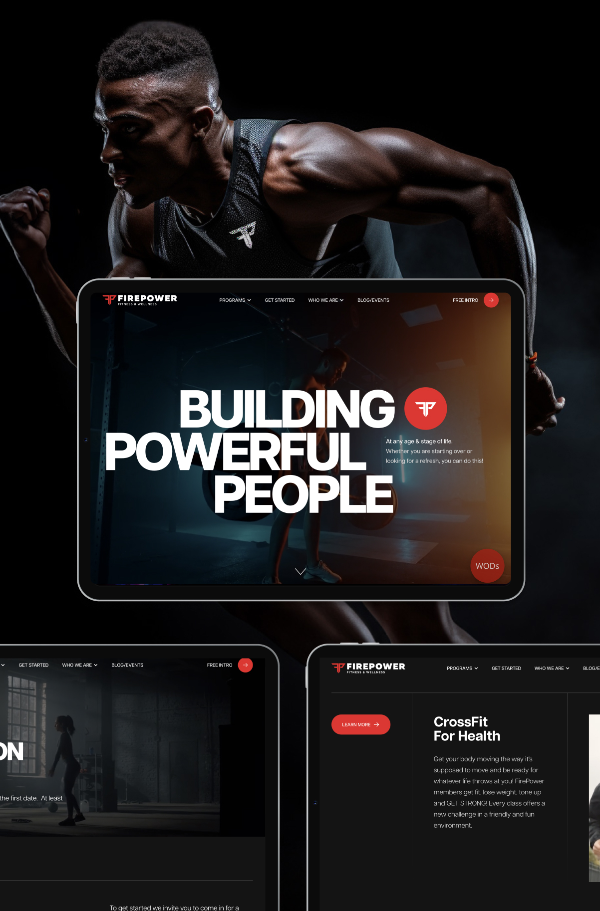
In web design, color is more than just decoration; it’s a communication tool. The colors you choose can determine how users feel about your site and, by extension, your brand. It’s about creating an environment that aligns with your brand’s identity and message. Whether it’s the calmness of green for a wellness brand or the boldness of orange for an innovative tech company, color choices can make a profound impact.
Selecting the right color palette for your website is a strategic decision. It involves understanding your brand’s personality, the emotions you want to evoke, and the actions you want to encourage. It's also important to consider cultural color meanings to ensure your site resonates with a diverse audience. Remember, the goal is to choose colors that complement your brand and appeal to your target audience.
Let's take a look at some examples. A finance website might use blue to communicate trustworthiness and security. A children’s educational site could opt for a mix of bright, playful colors to engage young minds. These decisions aren’t just aesthetic; they’re strategic moves to connect with their audience.
However, it's easy to fall into color traps. Overloading a website with too many colors can lead to a confusing and off-putting user experience. Likewise, insufficient contrast can make content hard to read. The key is balance: your colors should complement, not compete with each other.
The colors of your website do more than fill space; they create a mood, convey a message, and influence perceptions. As we’ve seen, the psychology of color in web design is a powerful tool in your branding arsenal. So, the next time you’re designing a website, think beyond aesthetics; think about the story your colors tell. That’s where true engagement begins.